
GotSport (GotSoccer) is the leading provider of soccer software in the USA. They have been developing tools to help get players on the field since 1996, and help make things simple and easy for the sports community.
The existing mobile application exhibited numerous inconsistencies in its UI, including varying font sizes, off-brand colors, and inadequate contrast that failed to meet accessibility standards. Additionally, users faced several experience challenges, such as a confusing chat interface and the absence of a dashboard to quickly provide essential information upon opening the app.
Although I didn’t have direct access to users for interviews, I was able to interview stakeholders to gather insights. They provided feedback they had received from users and shared existing personas with me, which helped me understand the user perspectives indirectly.
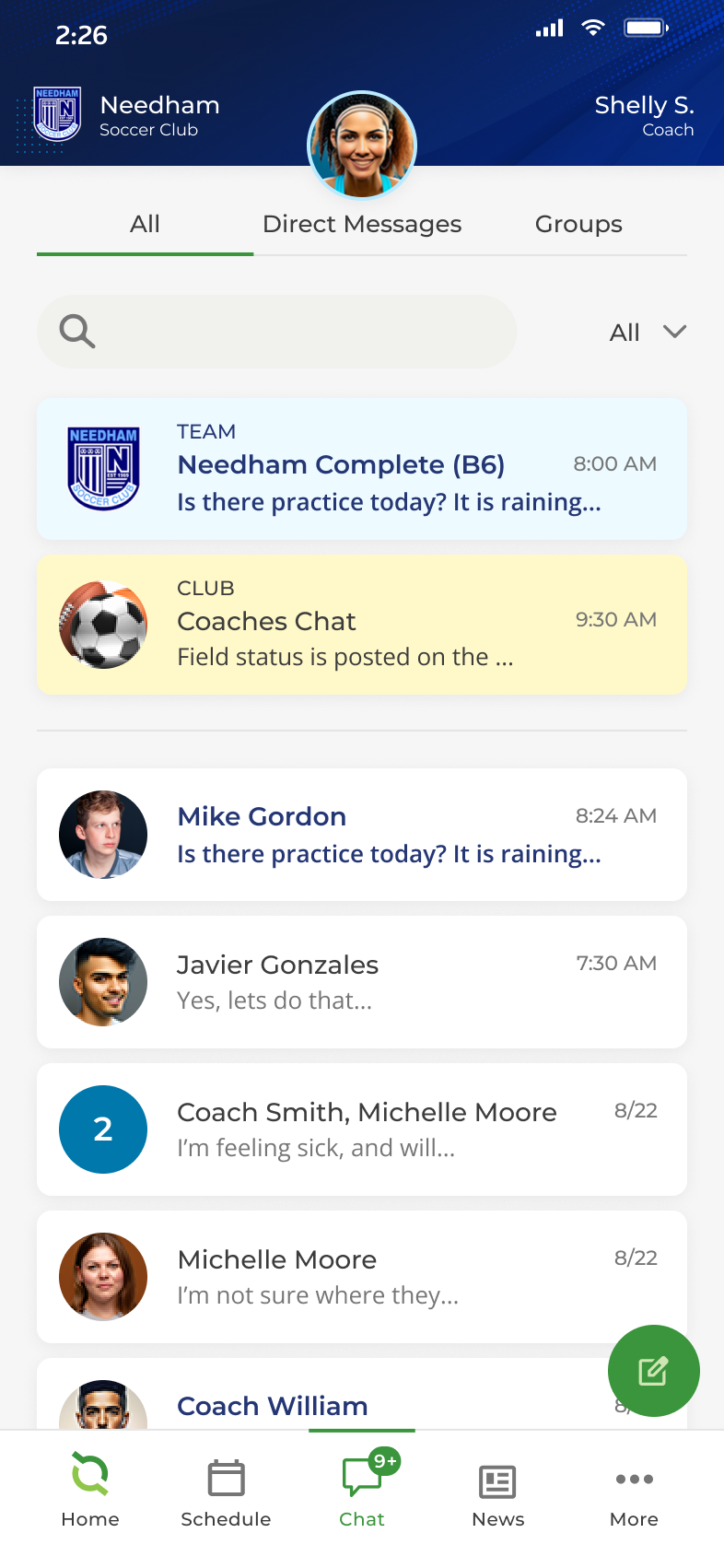
I designed a dashboard that features alerts from teams and coaches, an upcoming events module, chat notifications, and a dedicated space for sponsors. I completely reorganized and revamped the chat, contacts, and profile systems to enhance intuitiveness, allowing users to manage everything in one convenient location within the app. Additionally, I simplified and streamlined the processes for creating posts, starting chats, and setting up events by standardizing a familiar icon throughout the UI for a consistent user experience.
Happy customers! The new experience significantly boosted engagement with the app among parents, children, teams, and coaches. The introduction of pre-defined customizable color themes within the design system not only enhanced consistency across teams, but also streamlined the onboarding process for clients.
My first step was to interview the SMEs and stakeholders, and document their existing user personas. This allowed me to understand and empathize with the needs of the different user types and what issues they shared together.

I analyzed the existing user flow to gain a clear understanding of how the app was architected. By mapping out the app’s structure, I identified redundancies, pain points, and areas for improvement. This groundwork allowed me to re-architect the user experience to create a more streamlined and effective flow for users.
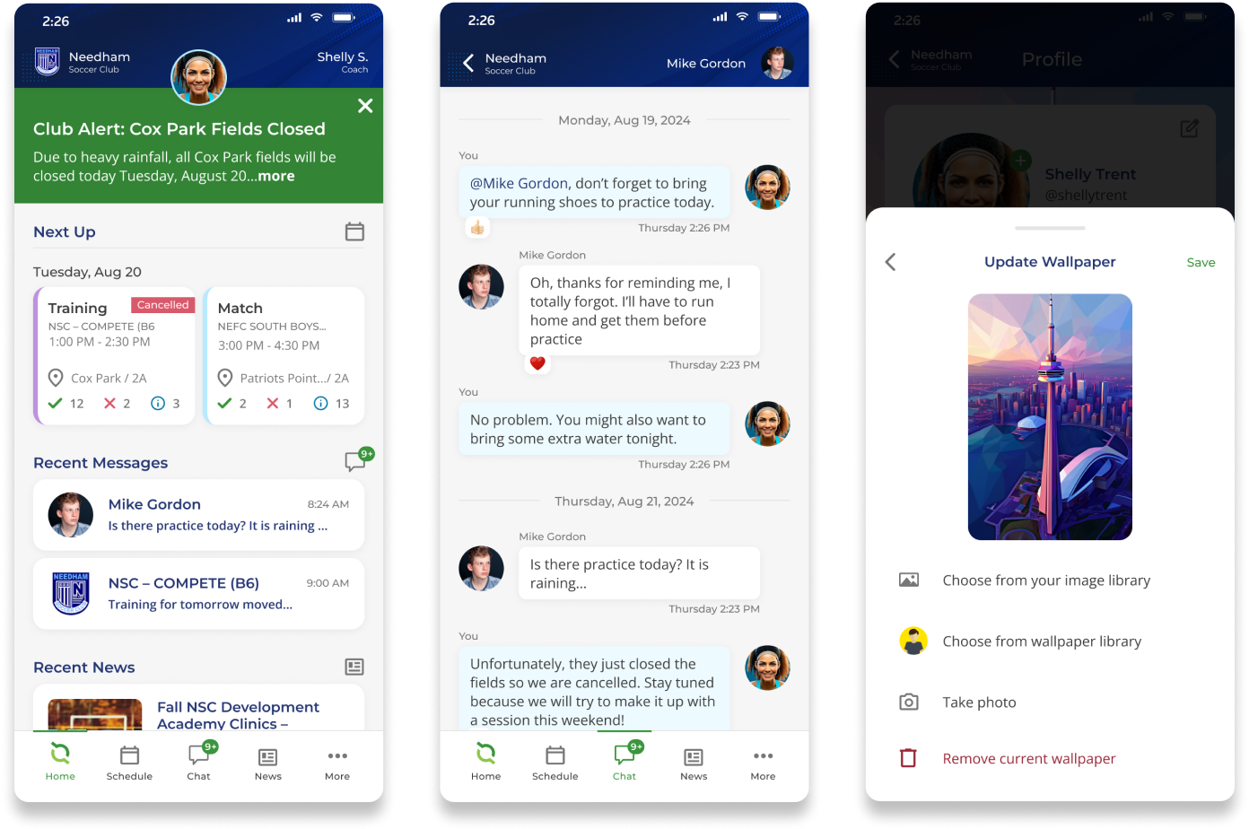
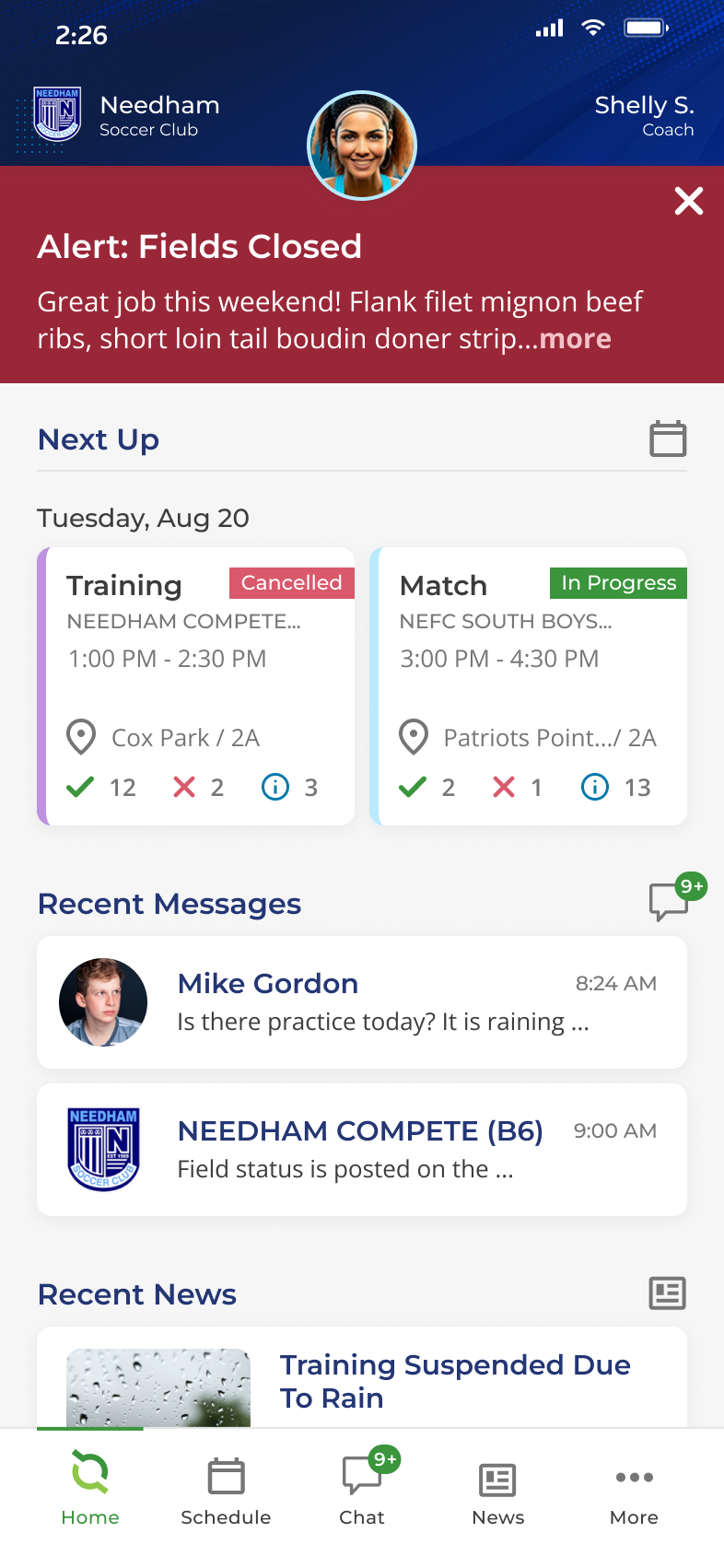
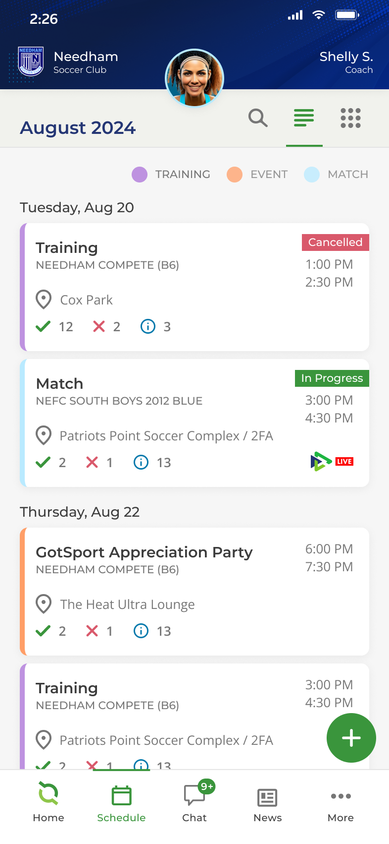
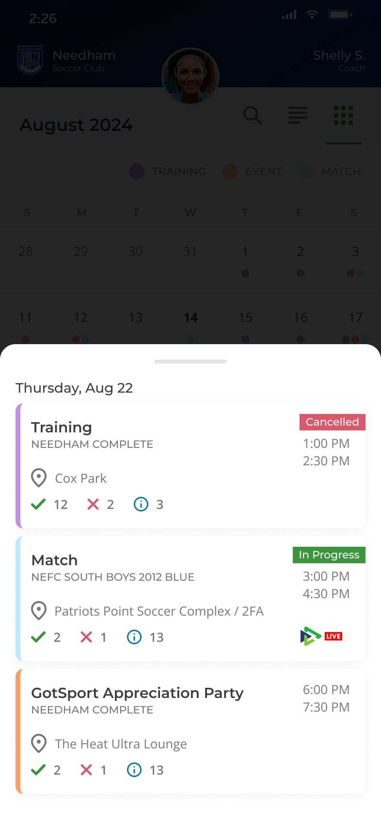
The new user flow introduced a dashboard to address the app’s previous limitations of dropping the user into news after login. The new dashboard enabled users to quickly access team and coach alerts, recent messages, news, and upcoming events immediately upon login. I also removed redundant and confusing features like Contacts and ID Cards, consolidating them into a unified and intuitive Profile view.


Wireframes are a crucial step in the mobile app design process, and serve as the blueprint for the app’s layout and functionality. They help me visualize the structure, user flow, and key interactions without the distraction of colors or detailed visuals. The wireframes allowed me to iterate quickly with the client, gather feedback, and ensure the app’s interface met client's needs before moving into high-fidelity visual design.


Project requirements often evolve due to user feedback, stakeholder input, or that something isn’t working as intended and could be improved. An example of this was the redesign of the top header area. Initially, the wireframes and visual designs featured a simple solid background, with space for a team logo and user avatar. However, the client wanted to enhance the sense of user ownership for teams and users.
To address this, I redesigned the header to make the user avatar the focal point—placing it at the center, increasing its size, and including the user’s name and role. Additionally, I updated the team logo to incorporate the team name and added texture to the header for more visual depth. To further align with the client’s vision, I successfully pitched the idea of customizable color themes that would reflect each team’s colors and branding.

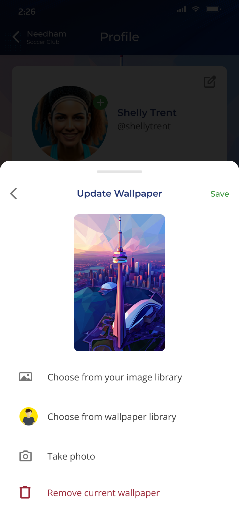
Building on the concept of ownership, I introduced a customization feature for user profiles, allowing users to personalize their profile with a wallpaper. Users could choose from the apps new wallpaper library, upload a photo from their device, or capture a new photo directly to use as their wallpaper.


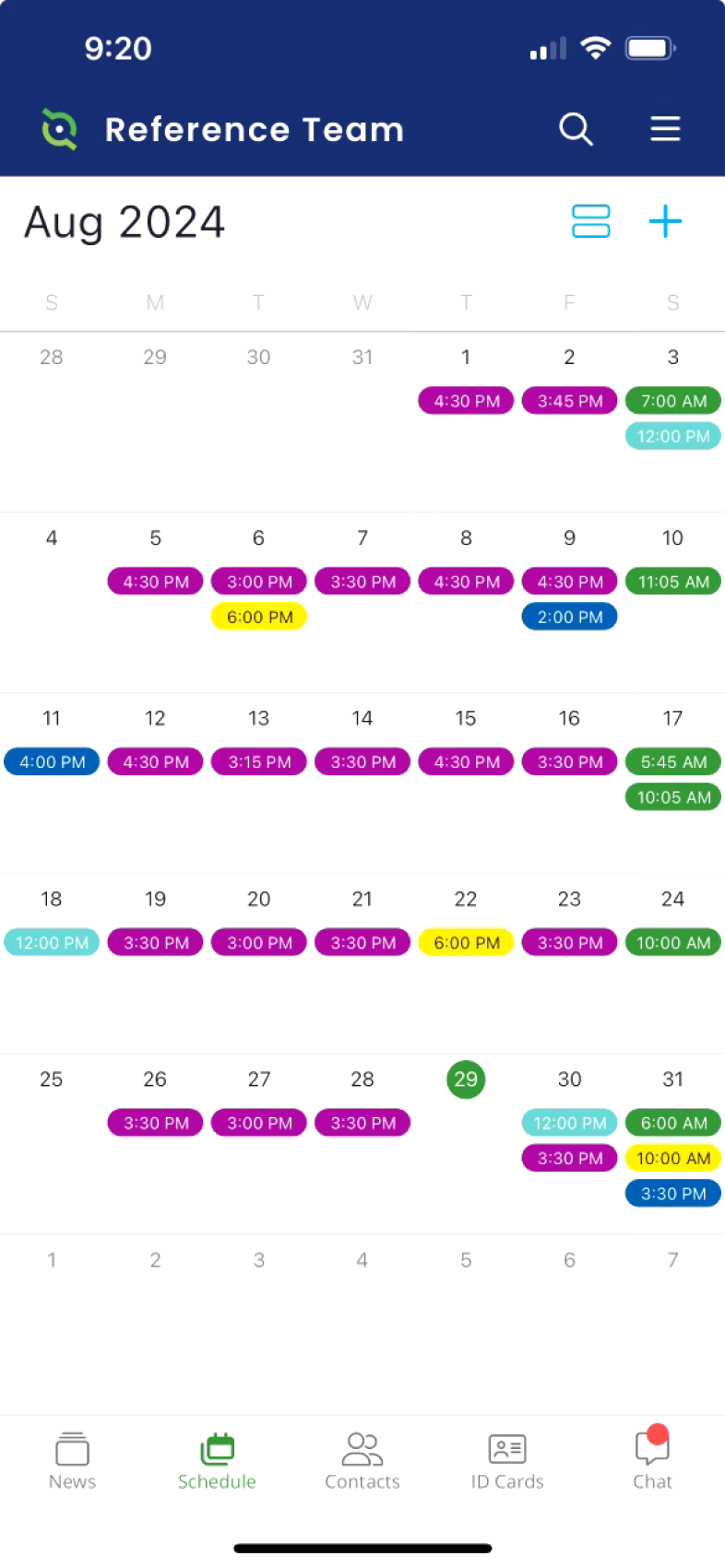
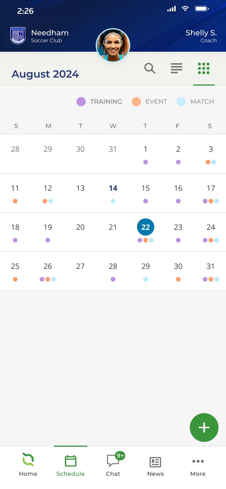
Post-launch feedback revealed that users were confused when clicking on a day in the month view, as they didn’t immediately see the day’s event list before the month component. By default, the current day was selected, which displayed the events for the day. This made it unclear that anything had changed after clicking a day. To address this, I redesigned the interaction so that no events were displayed by default, and instead, a popup overlay appeared to show the events for a specific day when clicked. This small change resounded with users positively, and increased the user interactions with the month view component.


Now let's put it all together, see how it all came together and shipped to customers with some before and afters, and how I solved for existing painpoints in the UX.
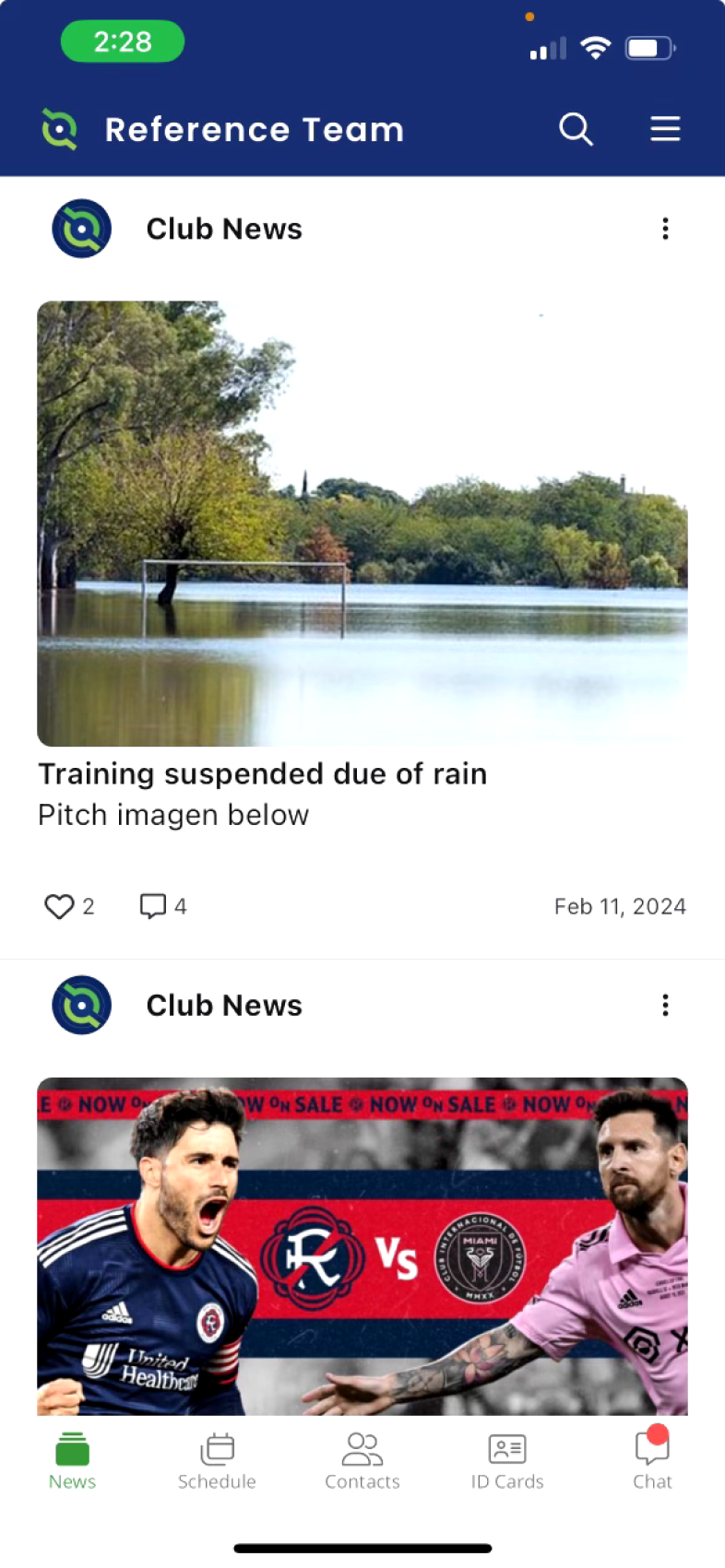
The app originally featured a news feed instead of a dashboard, which didn’t fully meet users’ needs upon login. I relocated the news to its own dedicated section and designed a new dashboard that provides users with alerts from their teams and coaches, upcoming events, chat notifications, and a space for sponsors.
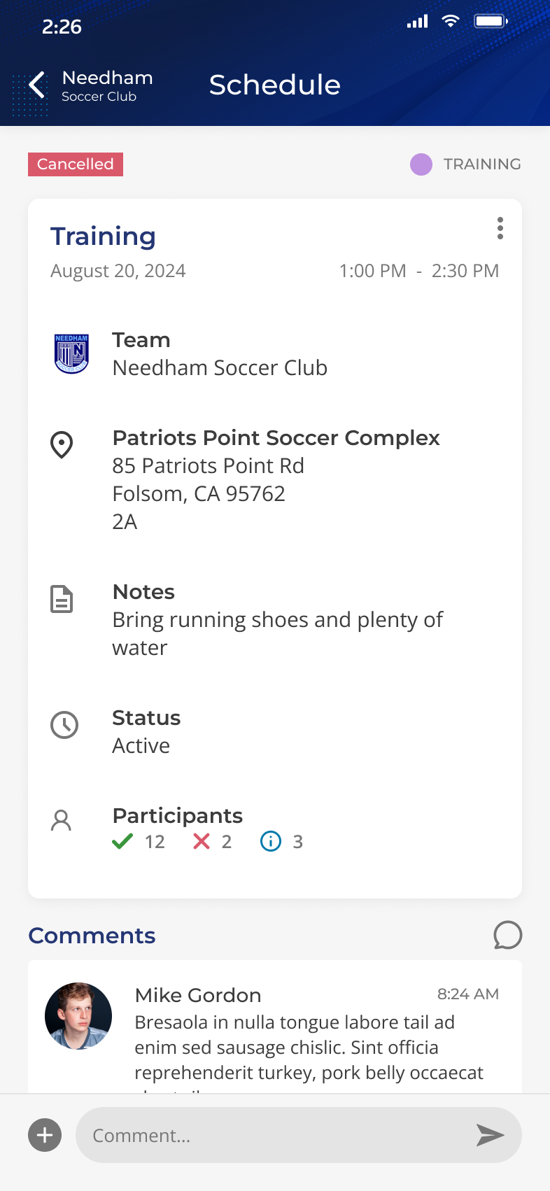
The schedule section featured nearly indistinguishable icons, colors that failed to meet accessibility standards, and lacked a legend to explain the meanings of the icons and colors. I introduced a legend for each event type, eliminated the icons, and redesigned the UI to be simpler and more readable at a glance.
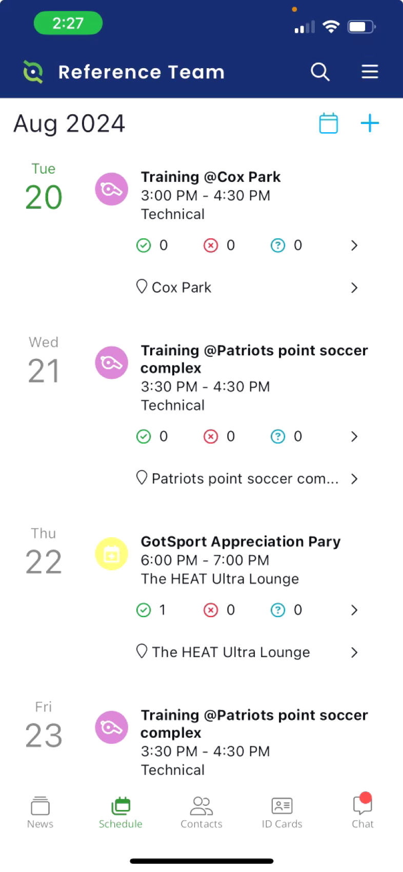
The month view was a user-requested feature, but it was challenging to see the times of each event, and clicking on a day led users to an entire event list. I redesigned this to use simple dots to represent each event type. Now, clicking on a day opens a pop-up overlay displaying the events for that specific day.
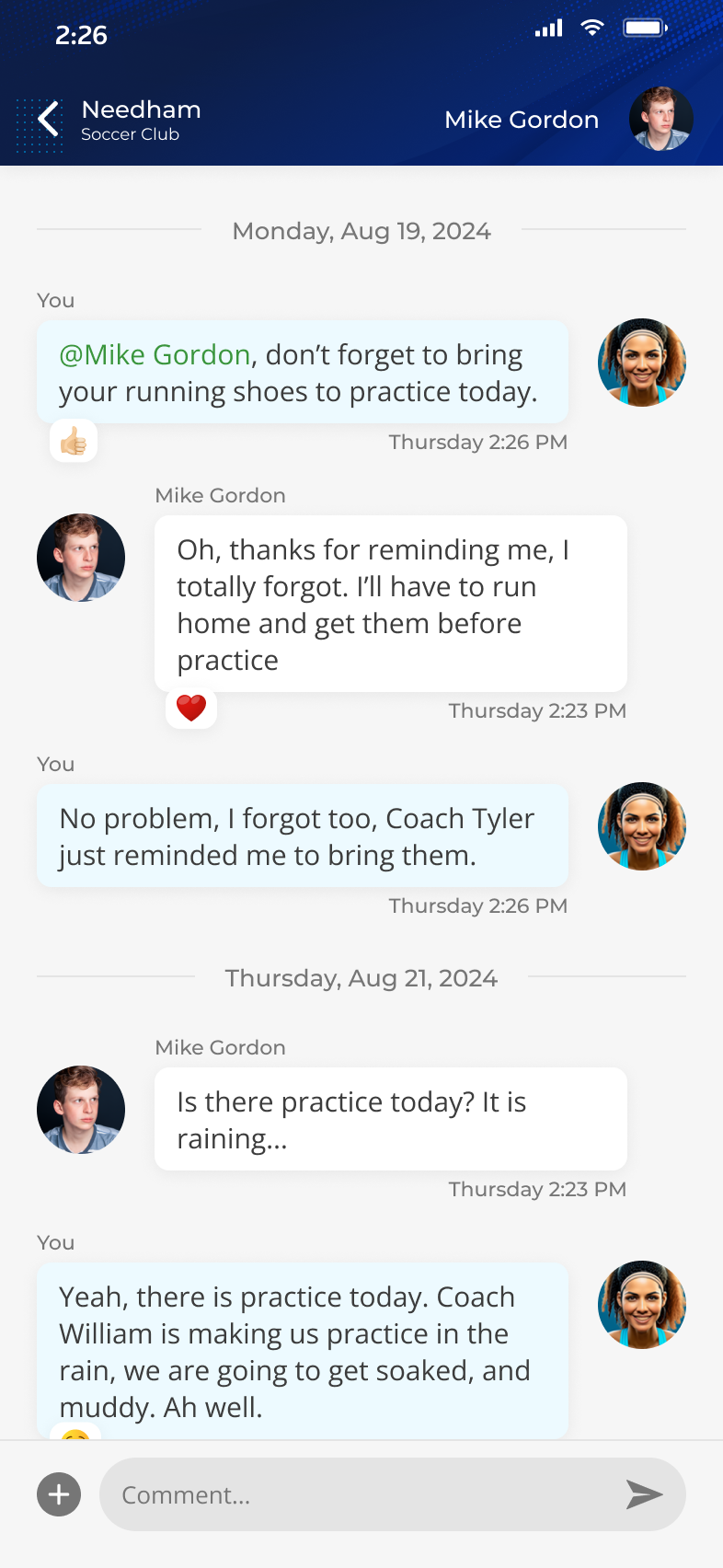
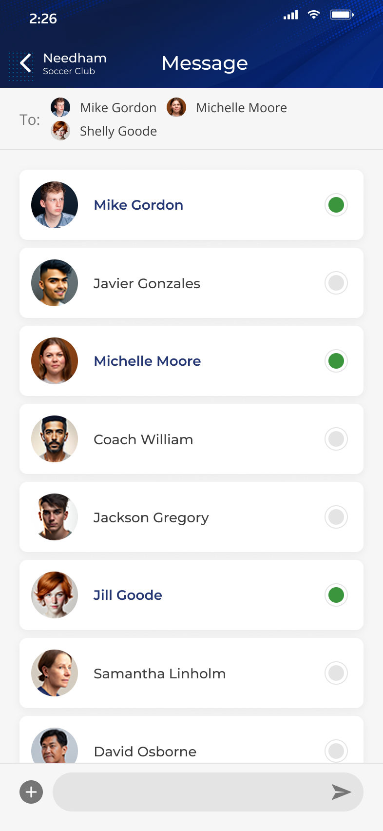
The chat, profiles, and contacts sections were overly complicated, with multiple options for initiating chats and an unnecessarily lengthy process. I streamlined the user experience by consolidating all chats into a single section, enabling users to manage everything in one place. Additionally, I pinned the team and coaches chats to the top of the feed and introduced filters for direct messages and group chats.
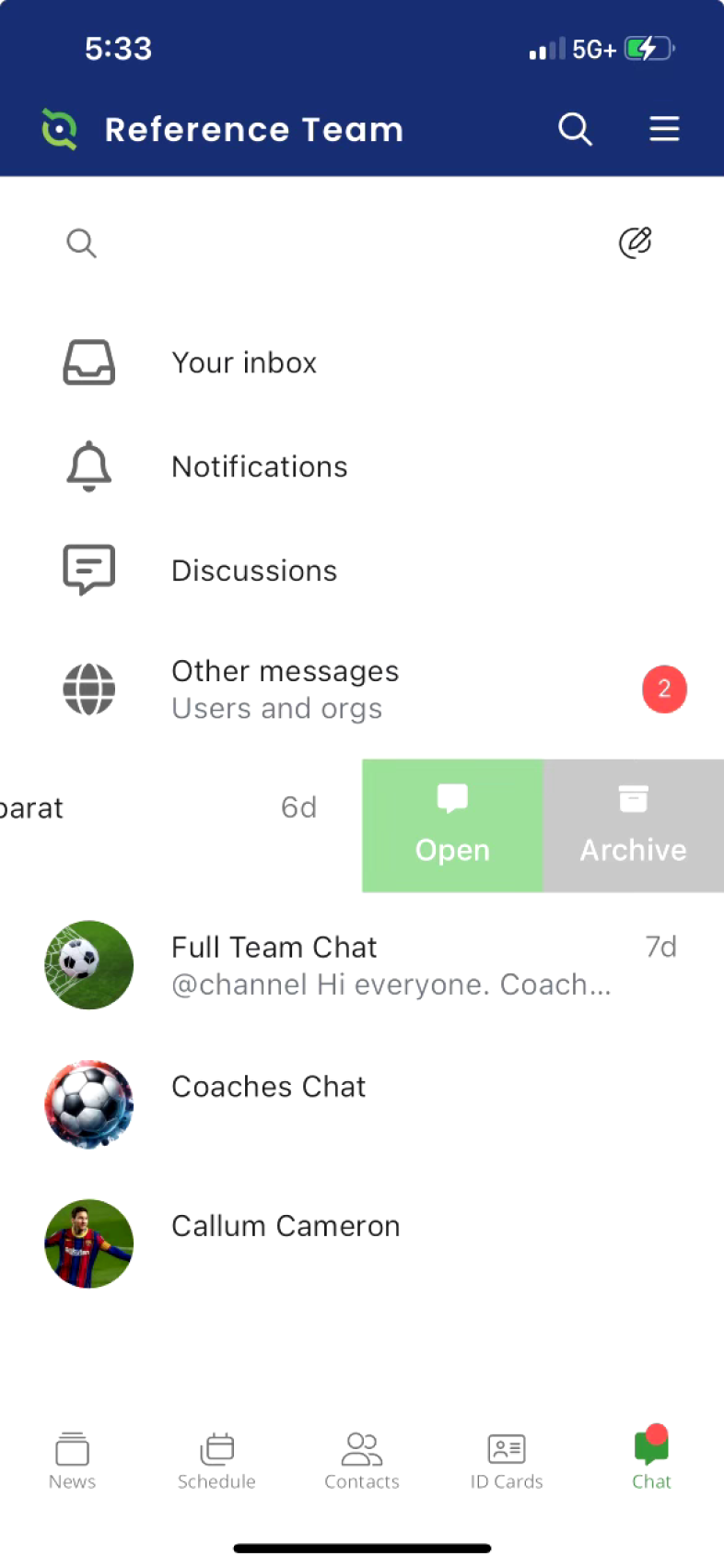
In the old flow, starting a direct message required users to click on a contact, access the ellipsis menu, select chat, and then create a new chat. To initiate a group chat, users had to navigate to the chat section, click search, choose "create a group chat", and then select participants. The new flow I implemented allows users to be taken directly into a chat by clicking on a contact. To start a new chat, users simply click the "create" button at the bottom of the screen and add the desired participants. Each chat can also be named and have a customized avatar.
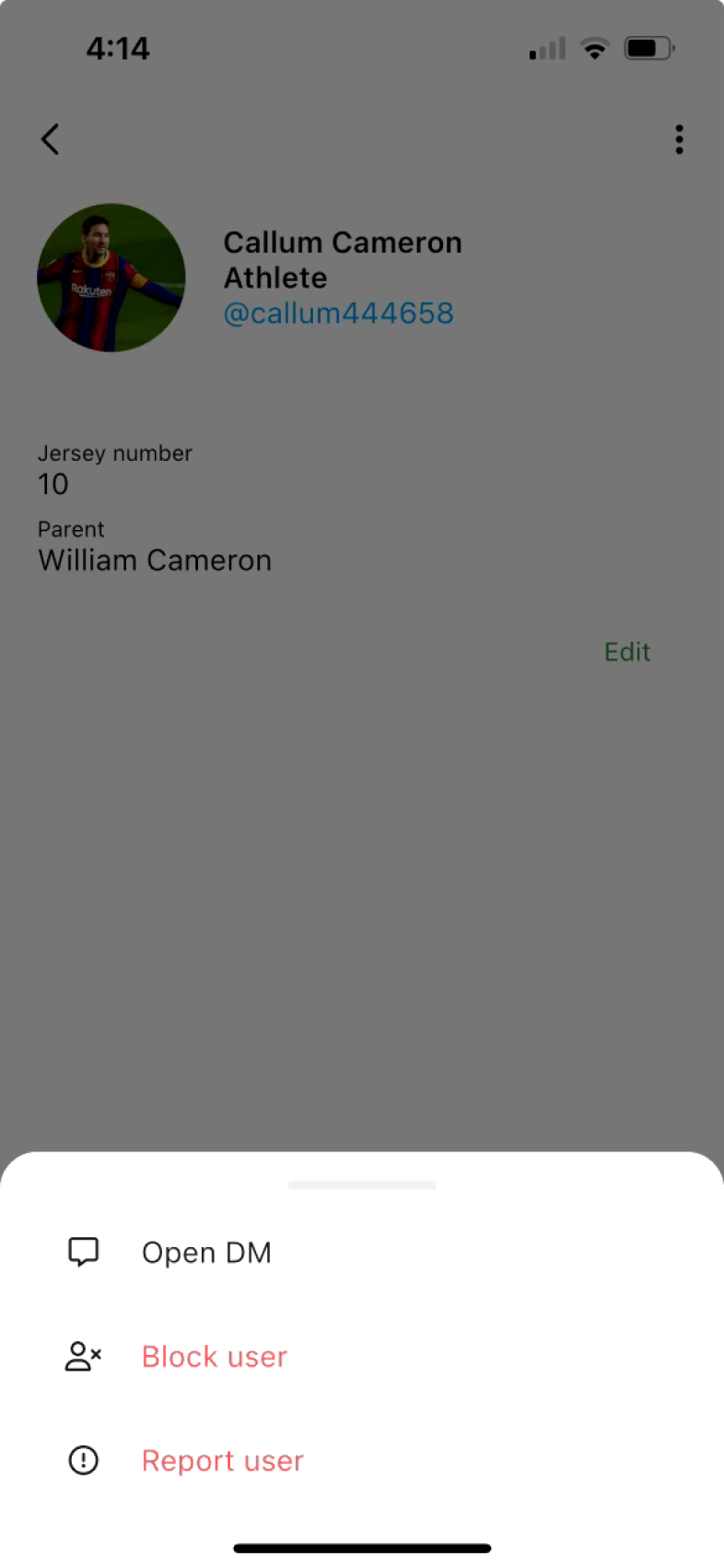
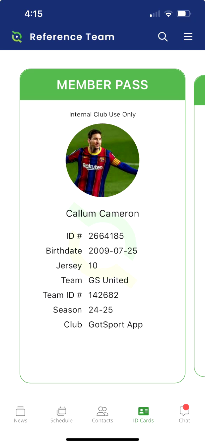
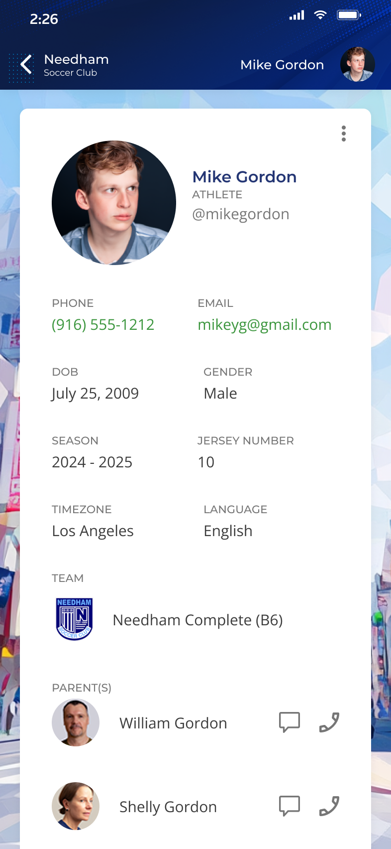
I designed a user ID card that allowed users customize their wallpaper and provides options to view a child's parents, message them in the app, or call them directly.
I designed a completely new icon library, replacing obscure, hard-to-identify icons for improved clarity and usability.
I developed an avatar library not only to enhance design and showcase to stakeholders, but also to allow users to select from a range of pre-designed avatars.
Building on the existing brand guide and legacy mobile app, I repurposed the color styles and introduced additional colors for use throughout the new app as part of the new design system.

DHCS provides Californians with access to affordable, integrated, high-quality health care, including medical, dental, mental health, substance use treatment services and long-term care. DHCS funds health care services for more than 15.4 million Medi-Cal beneficiaries.
Thomson Reuters is a global AI and technology company empowering professionals with trusted content and workflow automation. The Fraud Detect product suite utilizes expert machine-learning technology for government programs in Healthcare, SNAP, and Unemployment.